
Brand
Brand assets.
Logos, icons, colours and the rules for using them. Everything on this page is free to use when writing about tomake.design or building an integration.
Logos
Seven marks.
Pick the right one.
Every file is SVG, so it stays sharp at any size. Use the white variants on dark backgrounds and the standard variants on light ones.




Colour
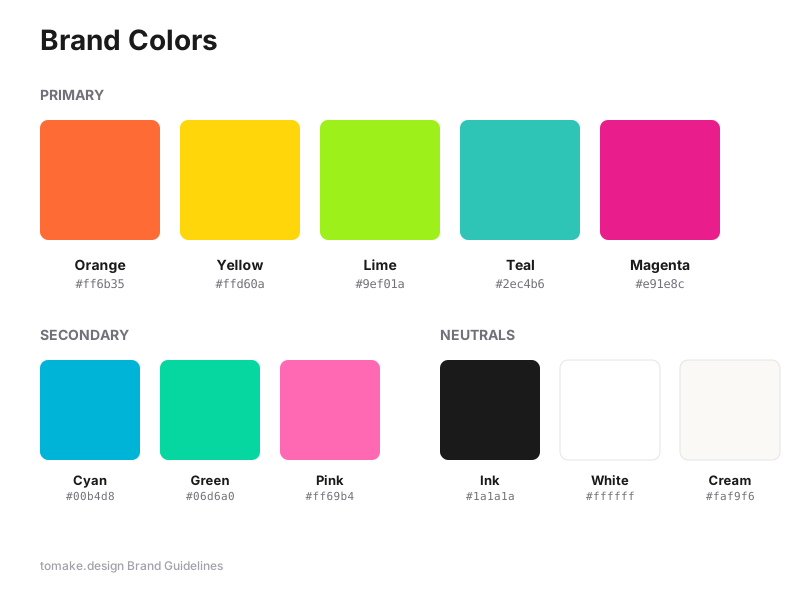
The palette.
Primary
Secondary
Neutrals
Type
Typography.
Display
Headlines
System UI at 800 weight, tight tracking. Used for every page headline.
Body
Running text
System UI at 400 weight. Inter is loaded on the site itself as the preferred face.
Wordmark
tomake.design
tomake.design — “to” in ink or white, “make” in orange, “.design” in grey.
Social
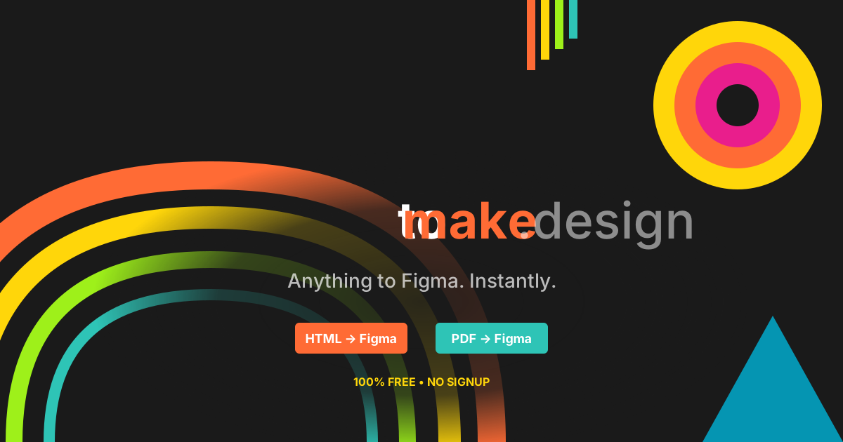
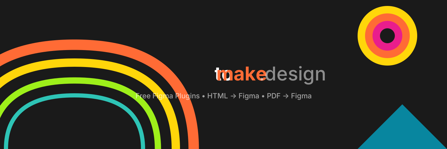
Share images.
Usage
Do and don't.
Do
- Use on ink (#1a1a1a) or white backgrounds
- Maintain the original aspect ratio
- Keep clear space around the logo
- Pick the white variant on dark backgrounds
Don't
- Distort, stretch or rotate it
- Recolour the mark or the wordmark
- Add shadows, gradients or outlines
- Place it on a busy photographic background
Export
Icon sizes.
Export logo-icon.svg at these sizes when you need raster icons.
Favicon
16×16, 32×32, 48×48
Apple touch
57×57 through 180×180
Android
36×36 through 192×192
High-res
512×512
Need something
that isn't here?
Press enquiries, a logo in another format, or a question about usage — just ask.